

Research I POV I UX / UI Design
Case Study: RunYourHealth
User-Centered Design of a Health App: From Idea to Implementation Handoff
A holistic health app providing guidance on nutrition and fitness, while helping users stay on top of daily and medical appointments — all in support of a healthier lifestyle.

Product
Responsive Application
Role
End-to-end product design: from research and conception through visualization and testing.
Project Time
6 months
Tools
Figma, FigJam, drawio, Canva, Optimal Sort, Zoom, Stark
I began with a research phase following the Double Diamond strategy, in order to minimize bias and maintain a broad perspective from the outset. To develop a deep understanding of the problem space, I conducted user interviews aimed at uncovering frustrations and unmet needs — ultimately leading to a clearly defined problem statement.
Problems Users Are Facing
- Users lack knowledge about healthy nutrition and struggle to make sustainable, long-term dietary changes.
- Users find it difficult to discover recipes that match their individual preferences and dietary needs.
- Users face challenges when trying to incorporate regular physical activity into their daily routines.
- Users have difficulty keeping track of medical appointments.
Problem Statement
Busy professionals need a solution that helps them improve their diet, integrate more physical activity into their daily routine, and manage both personal and medical appointments — driven by a desire for a more holistic lifestyle and simplified health management through a comprehensive, educational, and motivational app.
Solution Approach
An app that brings together nutrition, fitness, and time management in one place. Users enter their personal data to receive tailored workout plans, meal suggestions, and scheduled time slots for exercise — guiding them step by step toward a more balanced and holistic lifestyle.
Target audience
This app is designed for adults between the ages of 25 and 40. Younger users tend to place less emphasis on health management, while older adults may require more specialized programs adapted to their specific fitness levels and nutritional needs.

Research
Competitor analysis
I conducted a competitor analysis to evaluate the strengths, weaknesses, and market opportunities of comparable apps.
My analysis covered a range of nutrition and fitness applications — including Samsung Health, MyFitnessPal, Gymondo, and 8fit — as well as relevant online magazines and blogs. Across the apps reviewed, several core features emerged consistently:
- Workout videos for guided training sessions
- Point-based nutrition systems as an alternative to calorie counting
- Self-assessed nutrition and fitness plans tailored toward fat loss
- Motivation tools such as progress tracking, workout videos, and push notifications for upcoming sessions
Research Goals
The research was guided by the following objectives:
- Understand how users currently manage their health-related concerns.
- Identify the everyday challenges that prevent them from reaching their health goals.
- Determine which features and functionalities are essential for a truly helpful app, and uncover pain points users experience with existing solutions.
User Interviews
To gain a deeper understanding of the challenges and needs of the target users, I conducted a series of user interviews.
By analyzing the qualitative data collected, I was able to define two distinct user personas representing the primary target groups — enabling me to better address their needs and prioritize design decisions effectively.
Sorting Results
Affinity Map

Main Interview Insights
- Family-friendly nutrition — Meal plans should cater to both adults' dietary needs and children's preferences.
- Growing interest in alternative nutrition — Vegetarian and vegan diets are becoming increasingly relevant for users.
- Need for flexibility — Time management plays a crucial role in maintaining healthy habits consistently.
- Motivation — Regular reminders are essential to keep users engaged and on track with their goals.
- Value of education — Scientifically backed information is highly valued, particularly among users who aim to set a healthy example for their children.
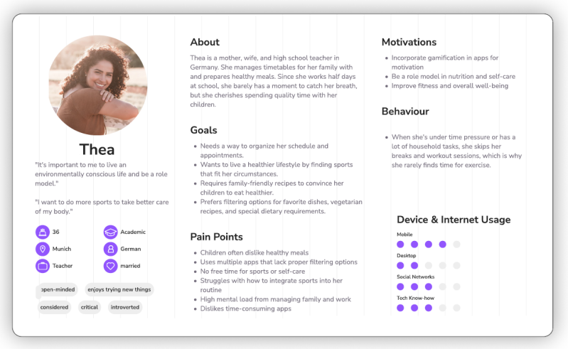
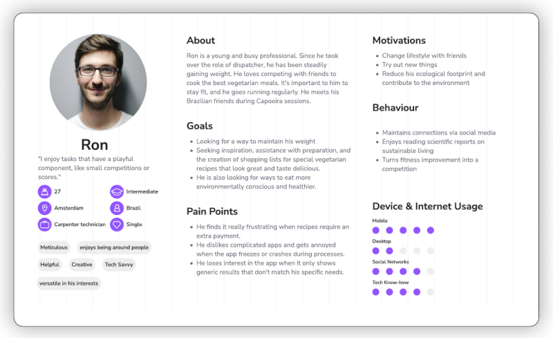
User Personas
To gain a deeper understanding of the target users' challenges and needs, I conducted a series of user interviews. By analyzing the qualitative data collected, I defined two distinct user personas representing the primary target groups — enabling me to better address their needs and prioritize design goals effectively.
User Flow
To ensure a user-centered design that holds up from the user's perspective, I created user flows. These allowed me to visualize the complete journey through each task and confirm that all user needs were accounted for within the experience.

Low-Fidelity Prototypes
Low-fidelity wireframes were tested in usability studies, enabling quick and cost-effective adjustments before committing to the more resource-intensive digital implementation.
In the initial sketches, the focus was on establishing functional and intuitive navigation. Through successive iterations, the wireframes were refined to improve overall usability.
A key insight from this phase was the importance of delivering meaningful content with sufficient spacing — directly contributing to better readability and a more comfortable user experience.


Mid-Fidelity Prototypes
To communicate both form and functionality, I developed mid-fidelity prototypes with a focus on grid structure, spacing, and content refinement — ensuring clarity and coherence in the overall presentation.
I also took the opportunity to design custom navigation icons, further developing my skills within the tool.
High-Fidelity Prototypes
For the high-fidelity prototypes, I applied my self-developed design system and continued to refine my Figma proficiency through multiple iterations. Throughout this phase, I prioritized clarity, functionality, and accessibility — clearly distinguishing content sections, using appropriately sized sans-serif typography, and maintaining high-contrast color combinations.
When incorporating content, I focused on purposeful visuals that allow users to grasp context at a glance, without relying on explanatory text.
Design Systems
I developed a comprehensive design system to ensure a cohesive user experience and maintain consistency throughout the prototyping process.

Iteration & Testing
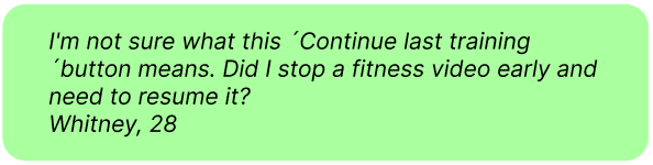
Drawing on feedback from user testing, A/B tests, peers, and tutor evaluations, I continuously iterated on my design. One key takeaway from the testing process was the importance of adopting the user's perspective — to better anticipate how they might interpret given tasks. Some issues could have been avoided by phrasing tasks more clearly and in closer alignment with user expectations.
From Redundancy to Valuable Content
While I maintained a strong focus on clear structure, accessibility, and meaningful content, I initially overlooked the lack of added value in the tiles for the main categories. User testing revealed this gap — 60% of participants noted that they were missing relevant content.
In response, I redesigned the home screen to surface key information that had previously been buried in subcategories. The updated screen now features a progress chart, today's fitness challenge, upcoming appointments, a grocery list, and personalized recommendations.


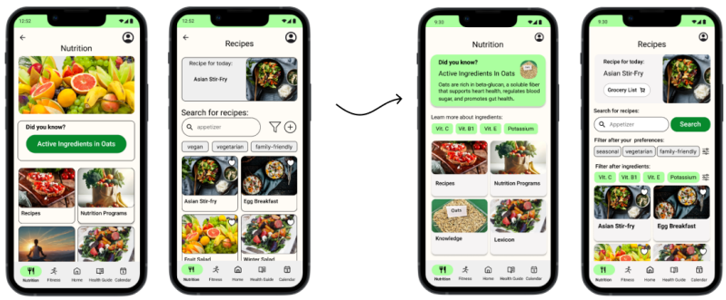
Focus on Clear Descriptions, Images, and Icons
During user testing, 100% of participants struggled to understand the workout tiles due to insufficient visual clarity. Additionally, participants misinterpreted the cherry icon as unrelated to nutrition — particularly when they skipped the accompanying description. What felt self-explanatory from a designer's perspective was not always clear to the end user.
Improvements
- Rewriting descriptions and adding informative photos and icons
- Replacing the progress chart on the dashboard
- Displaying the daily fitness program plan within the fitness overview

Give Valuable Features More Prominence
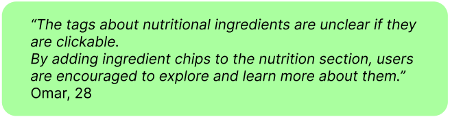
In a feedback session with UX design students, 60% found it difficult to understand the purpose of the ingredient chips and raised concerns about features being too hidden — such as the grocery list.
- Redesign of the "Did You Know?" knowledge tag
- Replacement of ingredient tag labels and addition of clearer descriptions
- Addition of a contextual "Grocery List" button to the daily meal suggestion
Solutions to Meet User Needs
Time Management That Fits
Pain Points
Users need support with organization and time management to integrate healthier habits into their daily routines and carve out dedicated time for exercise.
Solutions
- Plan your day and schedule personal time while staying on top of both everyday and medical appointments.
- Receive timely reminders for upcoming appointments.
- Add new appointments quickly and with ease.
- Get personalized fitness session suggestions that fit your available time slots.


Holistic Nutrition: Recipes, Programs & Insights

Pain Points
A key challenge in improving family nutrition is finding recipes and meal plans that balance adults' dietary requirements with children's taste preferences.
During testing, 60% of participants highlighted an insufficient variety of vegan and vegetarian recipes — with most plant-based options limited to side dishes. Users also noted the absence of dietary preference filters.
Solutions
- Personalized recipes tailored to individual preferences and dietary needs
- Nutritional education to support a better understanding of healthy eating
- An integrated grocery list for effortless meal planning
Fitness: Motivational Programs & Inspiration for Exercise
Pain Points
Users struggle to maintain consistent motivation to exercise. Many are also uncertain about which type of training would best suit their personal fitness level and goals.
Solutions
- Personalized workout plans adapted to individual needs and preferences
- Motivational tools and inspirational content to support long-term engagement
- Guidance on training types to help users make informed decisions about their fitness routine

Key Learnings
Asking the Right Questions
I learned how crucial it is to ask questions in a way that opens up meaningful conversations. The quality of the answers directly determines how accurately core problems are identified from the outset — shaping the development of user stories and the direction of the entire project. When answers lack depth, it becomes difficult to form a complete picture, putting the project at risk of failing to deliver real value to its users.
Incorporating Early Feedback Loops
In this project, I initially gathered user feedback by testing a high-fidelity prototype. Further along, I received input from peers — fellow UX designers — which surfaced new perspectives on feature prioritization, including elements that had been buried in subcategories. Because this feedback arrived at a late stage, implementing the necessary changes required considerable time and effort. Going forward, I would integrate peer feedback much earlier in the process, before moving into user testing, to save both time and resources.
Designing Tasks for Usability Tests
During my usability tests, I realized that users were starting from a different baseline of knowledge than I had assumed — I had lost sight of putting myself in their shoes. As a result, the tests surfaced issues and friction points that could have been avoided with more careful preparation. This experience reinforced that it is essential to first understand where users need to be guided before formulating tasks for a usability test.
Looking for a smart, user-centered design solution?
Let's turn your ideas into intuitive, engaging experiences.
Feel free to reach out — I'd love to collaborate!
Contact me:

Erstelle deine eigene Website mit Webador