

Case Study
Design Thinking I User Research I UX Design
Vocab Boost
Vocab Boost is a vocabulary app designed to help professionals expand their language skills through interactive, audiovisual learning units and gamified elements — making language learning both effective and enjoyable.
Challenge
How can an app be designed to genuinely empower users in learning new vocabulary?
Process
I researched existing competitors to identify opportunities for a new app. Through user interviews, I gained in-depth insights into user needs and behaviors, then developed a persona to define key user goals. Building on this foundation, I mapped out the necessary steps and designed a low-fidelity prototype.
Goals
The app combines interactive audiovisual learning with real-life examples, domain-specific audio texts, and gamification elements — keeping users motivated and consistently engaged.
Product
Vocabulary App
Role
UX Designer — Research to Conception, Visualization, and Testing
Stakeholder
Tutor at CareerFoundry
Tools
Figma, draw.io, Pen & Paper, Lyssna
Project Time
2 months
Competitor Analysis
I compared three existing vocabulary apps, each offering distinct approaches to language learning.
WordUp supports learning across multiple modalities — visual, auditory, and kinesthetic — and rewards user progress. The interface feels modern and well-designed. Available via paid subscription.
Babbel tailors its learning programs to individual user preferences and is highly intuitive to use. It offers a well-structured experience with a varied range of exercises to keep learning engaging. Available via paid subscription.
Memorion is a free app that focuses on gamification to enhance retention. However, its dark interface and animated icons may prove distracting for some users.


User Interviews
To understand the target audience, I conducted in-depth user interviews that revealed key motivations, frustrations, and preferences around vocabulary learning. A central finding was that gamification is highly effective — particularly when combined with multiple learning methods, including visual, auditory, and reading-based exercises.
User persona
Drawing on these research insights, I developed the user persona Lara, which helped me define a clear problem statement and design targeted solutions.

User Stories
- As Lara, I want to expand my vocabulary with industry-specific terms and practical examples, so that I can navigate workplace conversations more confidently and accelerate my career development.
- As Lara, I want vocabulary presented with images and usage examples that I can apply directly in my professional context.
- As Lara, I want to track my learning progress so that I can see when I reach the next level.
- As Lara, I want progressively challenging tasks so that studying feels engaging and motivating.
- As Lara, I want to learn as efficiently as possible in short, focused units, so that I can still maintain time for other activities.
Job Stories
- When I encounter language barriers at work, I want to note down unfamiliar phrases and words so that I can look them up and learn them later.
- When I go for my daily run, I want to complete listening exercises so that I can improve my comprehension on the go.
- When I relax on the sofa in the evening, I want to learn in a playful, audiovisual way — so that it feels more like entertainment than studying.
Problem Statement
Lara needs an efficient way to learn vocabulary and phrases relevant to her professional field, because she wants to grow in her career.
We will know this has been achieved when misunderstandings caused by language barriers decrease and her performance on projects improves.
Hypothesis Statement
We believe that by providing Lara with compact, interactive audiovisual learning units, real-life examples, gamified sequences, and domain-specific audio texts, we can significantly expand her vocabulary and overall language comprehension.
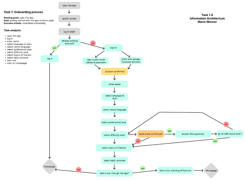
Task Analysis and User Flow
After defining the primary user goals, I developed user flows for the app's two key features. By establishing clear start and end points alongside success criteria, I ensured a logical structure that incorporates all necessary steps at the right moment in the user journey.
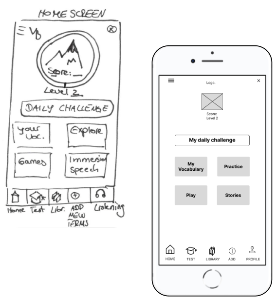
Sketching & Wireframing
Creating screens that align with the user flow was the clear goal — but how to structure them clearly while incorporating meaningful features? I worked through several iterations to integrate the strongest ideas, always keeping my persona's needs at the center of every decision.

User Tests
This was my first experience prototyping and testing with low-fidelity prototypes in Figma. I conducted tests with three participants and gathered valuable insights about the prototype.
As the sessions were conducted in person, I was also able to observe participants' facial expressions and body language — allowing for a more empathetic and nuanced reading of their responses.
Test Plan
- Complete onboarding and sign-up, including a level assessment test
- Add a new vocabulary term
- Review vocabulary by taking a quiz
- Discover the method for learning that doesn't feel like studying
Test results
The labeling of certain tiles — such as "Immerse" on the start screen — was found to be unclear and in need of more descriptive naming. The function of the "Plus" button on the home screen was also ambiguous; some participants assumed it led to "My Vocabulary" instead.
"It's important that the structure is clear to me. It helps when there isn't too much information on each page." — Jess
"What does 'Immersion' mean? I don't know what to do with it." — Christina

Final Low-Fidelity Prototypes

Key Learnings
To truly meet users' needs and expectations, thorough research into the target audience is essential. User personas help translate specific requirements into realistic scenarios, which in turn inform the creation of meaningful user flows.
By continuously refining designs through iterative cycles up to the prototype stage, I maintain a user-centered approach that effectively addresses real user needs.
Going forward, I use descriptive and clearly labeled navigation icons and buttons to ensure intuitive navigation. I also place particular emphasis on conducting early usability tests, enabling relevant iterations to be incorporated efficiently and cost-effectively.
Future Steps
- Validate the improvements through further usability tests
- Enhance the tracking of user progress
- Further develop the playful features to make the app more engaging and interactive
Looking for a thoughtful, user-centered design solution?
Let's turn your ideas into intuitive, engaging experiences.
Feel free to reach out — I'd love to collaborate!
Contact me:

Erstelle deine eigene Website mit Webador